Style
Financial Report Visualizer
The Financial Report Visualizer style transforms raw financial data into engaging, easy-to-understand visuals. This effect excels at presenting complex investment portfolios, annual summaries, and key metrics in a professional, clean design. With vibrant charts and modern layouts, it brings clarity and impact to financial communications—perfect for business reports, presentations, and marketing for finance professionals, analysts, and investors.
Train AI Image Models
Train your own Character
Train a unique character from your own everyday photos, apply the ready to use Financial Report Visualizer to generate interesting and eye-catching images.

Input Image
Starting point for AI training is set of your images. More images of same character can be added to improve the model.
Pretrained AI model
Apply ready to use styles and effects on pretrained model or use custom prompt to generate images.


AI Generated Character with custom style
Images generated from the pretrained model
Visualize Your Financial Data Instantly
Transform spreadsheets into stunning visuals with the Photomatic AI Financial Report Visualizer. Communicate insights, trends, and results with clarity and style—perfect for reports, meetings, and investment updates.
What is Financial Report Visualizer? Description and History
Financial Report Visualizer is a modern design effect that translates complex financial data into visually compelling, easy-to-understand graphics. Leveraging clean layouts, bold color schemes, and professional typography, this style makes even dense numbers accessible. With roots in the evolution of business infographics and dashboard design, Financial Report Visualizer reflects best practices from financial reporting, UX design, and data storytelling.
As businesses embraced digital transformation, the need for clear, actionable financial communication soared. Early financial visuals were static and often cluttered, but advances in data visualization and AI-powered design have made it easy to create polished, interactive graphics that help audiences grasp trends, risks, and opportunities at a glance.
Who is Using Financial Report Visualizer?
- Financial Advisors & Planners: For client investment portfolios and quarterly performance summaries.
- Business Analysts: To present key findings and recommendations to executives.
- CFOs & Accountants: For annual reports, board presentations, and budgeting.
- Startups: To pitch financials to investors and stakeholders.
- Educators: To teach finance concepts through real-world visuals and infographics.
- Marketing Teams: To create compelling visuals for finance-oriented campaigns.
Examples of this effect
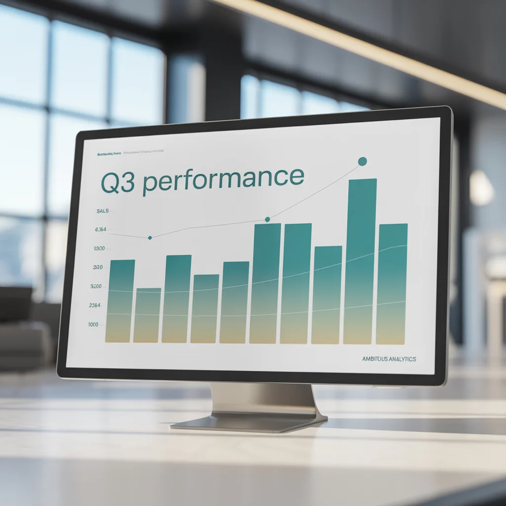
Financial Dashboard
Prompt: financial report, data visualization, clean design, professional layout, vibrant charts
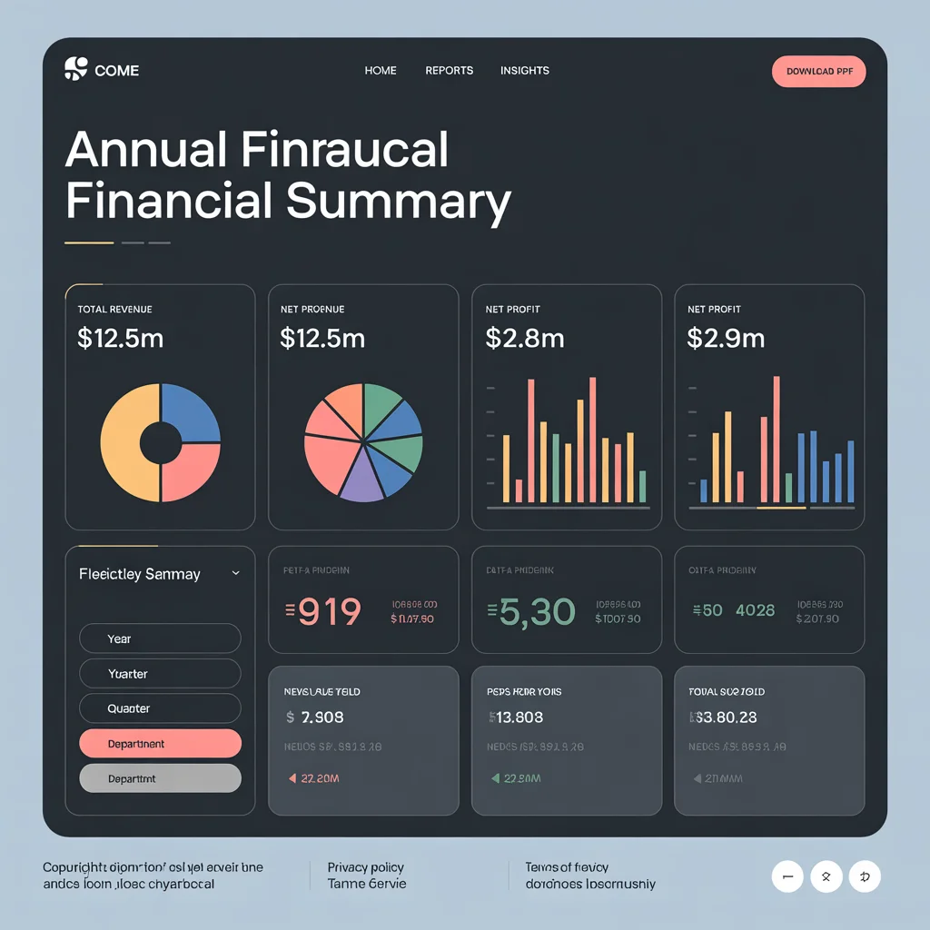
Annual Summary
Prompt: annual financial summary, dashboard, sleek design, pie charts and bar graphs, business presentation
How Does Financial Report Visualizer Enhance Photos?
- Clarity: Turns raw numbers into colorful, easily interpreted visuals.
- Professionalism: Uses modern, clean layouts that impress clients and stakeholders.
- Engagement: Vibrant charts and infographics capture and hold attention.
- Insight: Highlights key trends, outliers, and summaries, making meetings more productive.
- Branding: Consistent design elements reinforce your company’s visual identity.
Use Cases for Financial Report Visualizer: When and Why to Use It
1. Quarterly Performance Reviews
Quickly communicate wins, challenges, and next steps with clear visuals for executive meetings.
2. Investment Portfolio Summaries
Display asset allocation, risk, and growth with engaging infographics for client updates.
3. Annual Reports
Make dense reports readable and attractive for shareholders, boards, and employees.
4. Fundraising and Pitch Decks
Impress investors with visually compelling financial projections and market analyses.
5. Marketing Campaigns
Showcase ROI, budgets, and results in style for internal or external audiences.
6. Educational Materials
Help students and trainees grasp finance fundamentals with real-world examples and clear visuals.
Pro Tips for Using Financial Report Visualizer
- Keep it Simple: Focus on the most important data to avoid clutter.
- Use Color Wisely: Color-code charts for maximum impact and brand consistency.
- Highlight Key Metrics: Use callouts or bold graphics to draw attention to critical numbers.
- Maintain Consistency: Use a standard style for all reports to build trust and recognition.
- Update Regularly: Refresh visuals as data changes to keep stakeholders informed and engaged.
Automate your image generation with AI Agents
Generate At Scale With The Financial Report Visualizer
Frequently asked questions
- What is the Financial Report Visualizer effect?
The Financial Report Visualizer effect uses AI to turn raw financial data into engaging, easy-to-read charts and infographics. It’s designed to help finance professionals, analysts, and business leaders communicate complex information clearly and persuasively.
- How do I generate financial visuals with Photomatic AI?
Simply enter your financial data or summary, select the Financial Report Visualizer style, and let the AI create clear, vibrant visuals. You can use these graphics for presentations, reports, or investment portfolios.
- Is this style suitable for all types of financial data?
Yes, it’s versatile enough for annual reports, portfolio summaries, quarterly reviews, forecasts, and more. It works best with structured data—revenues, expenses, allocations, or trends.
- Can I customize the charts and layouts?
The style is designed for clarity and professionalism, but you can further tailor colors, chart types, and layouts to fit your brand or audience needs.
- Who should use the Financial Report Visualizer?
This style is ideal for financial advisors, business analysts, investors, CFOs, accountants, and anyone who needs to present financial information in a compelling, professional format.
We automate marketing with AI
Let us help you automate your marketing tasks. Our platform allows you to create custom AI chatbots, agents, and workflows that can handle a wide range of tasks, from customer support to content generation.
- High-Quality Visual Content
Generate professional marketing visuals in seconds. Our AI creates stunning images that maintain brand consistency across all your campaigns without expensive design services.
- Content Creation at Scale
Produce large volumes of customized content efficiently. Create hundreds of images, blog posts, and marketing materials simultaneously with our AI automation workflows.
- Custom Brand Identity
Train AI models on your brand assets to create unique, on-brand visuals for any campaign. Maintain consistent visual identity across all marketing channels with character training technology.