
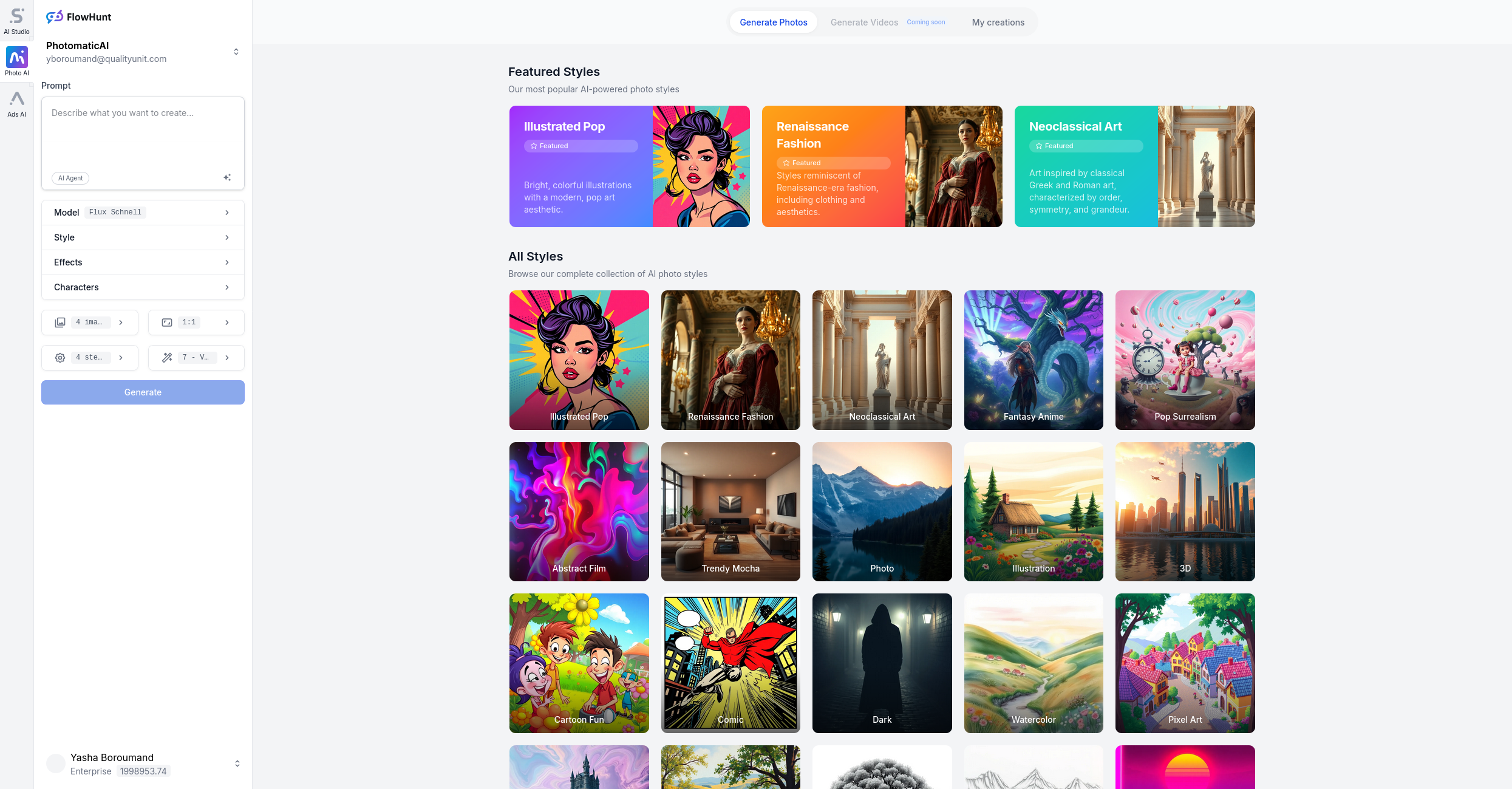
Style
Risk Assessment Visualizer
The Risk Assessment Visualizer style is designed to create impactful, professional visuals for risk management reports, presentations, and advertisements. This effect combines vibrant colors, clean layouts, and modern data visualization elements, making complex risk-related information accessible and engaging. It’s ideal for corporate communications, consulting reports, and executive summaries where clarity and professionalism are paramount.
Train AI Image Models
Train your own Character
Train a unique character from your own everyday photos, apply the ready to use Risk Assessment Visualizer to generate interesting and eye-catching images.

Input Image
Starting point for AI training is set of your images. More images of same character can be added to improve the model.
Pretrained AI model
Apply ready to use styles and effects on pretrained model or use custom prompt to generate images.


AI Generated Character with custom style
Images generated from the pretrained model
Visualize Risk with Clarity and Impact
Transform your risk management materials with the Risk Assessment Visualizer. Photomatic AI makes it easy to generate vibrant, professional visuals for reports, presentations, and campaigns in just a few clicks.
What is the Risk Assessment Visualizer? Description and History
The Risk Assessment Visualizer style is a modern approach to risk communication that leverages striking visuals and data-driven imagery. Traditionally, risk management materials relied on dense tables and text-heavy reports, which could be difficult to interpret quickly. With the rise of data visualization and digital design, today’s risk reports have evolved to use colorful charts, infographics, and clear layouts—helping stakeholders identify issues and opportunities at a glance.
This visual approach draws on trends in business intelligence, corporate design, and information graphics, making it an essential tool for professionals who need to communicate risk clearly and persuasively.
Who is Using the Risk Assessment Visualizer?
- Risk Managers and Analysts: For creating executive summaries and dashboard reports.
- Consultants and Auditors: To present findings and recommendations to clients.
- C-Suite Executives: For board presentations and strategy sessions.
- Marketing and Communications Teams: To design ad creatives that illustrate risk solutions.
- Project Managers: For stakeholder updates and risk status infographics.
- Educators and Trainers: To create learning materials about risk concepts.
Examples of this effect
Business Presentation
Prompt: businesswoman presenting risk management report with modern visuals, risk assessment, data visuals, vibrant colors, clean design, professional style
How Does the Risk Assessment Visualizer Enhance Photos?
- Clarity: Clean layouts and data visuals make information easy to absorb.
- Professional Appeal: Modern colors and sharp design elements elevate the look of any report or presentation.
- Engagement: Vibrant visuals capture attention and emphasize key messages.
- Insight: Infographics and dashboards enable faster understanding of complex risk scenarios.
- Consistency: The style ensures that all visuals, from charts to presentations, maintain a unified, professional appearance.
Use Cases for the Risk Assessment Visualizer: When and Why to Use It
1. Corporate Risk Reports
Transform dense tables and text into clear, visually engaging summary pages that highlight key risks, trends, and recommendations.
2. Boardroom Presentations
Create dynamic slides with infographics and data visuals that make your risk story compelling and memorable for executive audiences.
3. Consulting Deliverables
Add polish and impact to client presentations, making your risk findings stand out with professional, easy-to-read graphics.
4. Marketing and Ad Campaigns
Design ads for risk solutions or insurance products with visuals that communicate security, transparency, and expertise.
5. Training Materials
Develop engaging learning resources that simplify complex risk concepts for teams, students, or stakeholders.
Pro Tips for Using the Risk Assessment Visualizer
- Focus on Key Data: Highlight the most important risk metrics with color and placement.
- Maintain Readability: Use legible fonts and simple graphics for maximum clarity.
- Stay On-Brand: Match color schemes to your corporate identity for a cohesive look.
- Use Icons and Infographics: Visual elements can quickly convey messages that text alone cannot.
- Test for Accessibility: Ensure your visuals work well for all viewers, including those with color vision deficiencies.
Automate your image generation with AI Agents
Generate At Scale With The Risk Assessment Visualizer
Frequently asked questions
- What is the Risk Assessment Visualizer effect?
The Risk Assessment Visualizer effect is a specialized style for creating images that combine vibrant data visuals, clear layouts, and a professional look. It's tailored to communicate complex risk information with clarity and visual appeal.
- Who should use the Risk Assessment Visualizer?
This style is perfect for risk analysts, consultants, corporate managers, auditors, and anyone needing to present risk data or findings in reports, presentations, or marketing materials.
- Can I generate custom visuals for specific risk scenarios?
Yes! With Photomatic AI, you can describe your desired scenario—whether it's a risk dashboard, infographic, or business presentation—and generate bespoke visuals that fit your needs.
- Are the generated visuals suitable for commercial use?
Absolutely. The visuals created with this style are designed for professional and commercial contexts, including reports, advertisements, and presentations.
- How do vibrant colors enhance risk presentations?
Vibrant colors help highlight key data points, trends, and areas of concern, making complex information more engaging and easier to understand for diverse audiences.
We automate marketing with AI
Let us help you automate your marketing tasks. Our platform allows you to create custom AI chatbots, agents, and workflows that can handle a wide range of tasks, from customer support to content generation.
- High-Quality Visual Content
Generate professional marketing visuals in seconds. Our AI creates stunning images that maintain brand consistency across all your campaigns without expensive design services.
- Content Creation at Scale
Produce large volumes of customized content efficiently. Create hundreds of images, blog posts, and marketing materials simultaneously with our AI automation workflows.
- Custom Brand Identity
Train AI models on your brand assets to create unique, on-brand visuals for any campaign. Maintain consistent visual identity across all marketing channels with character training technology.