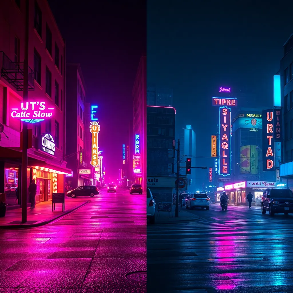
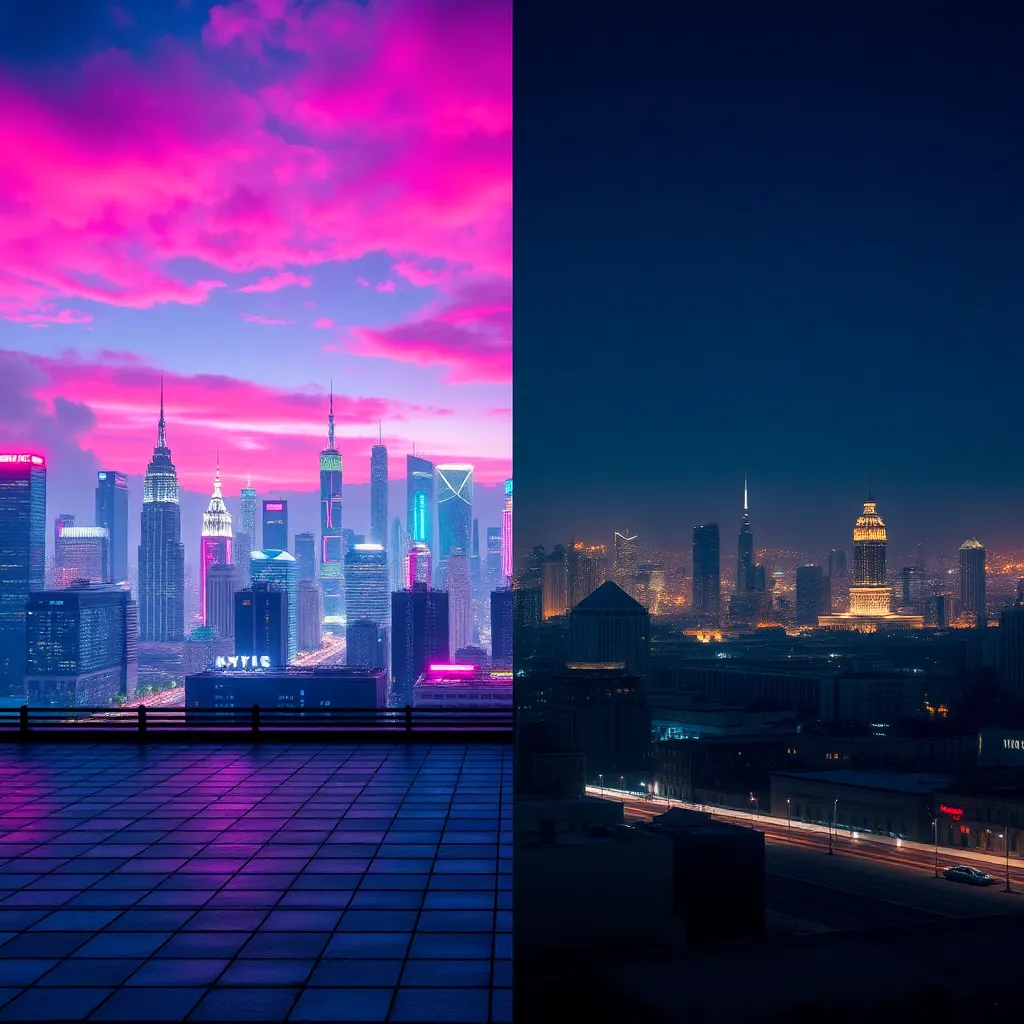
What is the Monocolor Words Style? Origins and Evolution
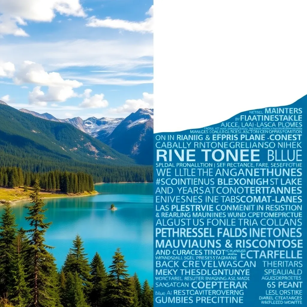
Monocolor Words is a contemporary graphic and photographic style where words or short phrases are rendered in a single, bold color, typically set against a minimalistic or contrasting background. This style strips away distractions, focusing the viewer’s attention entirely on the message and its emotional resonance.
The origins of this effect can be traced back to early 20th-century modernist design, particularly the Bauhaus movement, which championed minimalism, clarity, and the power of typography. Over the decades, the Monocolor Words style has evolved, finding a home in advertising, pop art, and digital branding. Today, with the rise of social media and digital content, its clean and impactful aesthetic has become more relevant than ever, used by designers and photographers to craft visuals that are both memorable and instantly communicative.
Who Uses the Monocolor Words Style?
The Monocolor Words effect is a favorite among:
- Graphic Designers: For branding, logo design, and visual identity projects that require strong recognition.
- Photographers: Especially those working in editorial, advertising, or social media, who want to merge text and image for a unified message.
- Marketers and Advertisers: To create eye-catching campaign visuals, slogans, or call-to-action graphics.
- Event Planners: When designing invitations, banners, and digital flyers that need to stand out with clear, elegant communication.
- Authors and Publishers: For book covers and promotional materials that demand instant impact and readability.
- Artists and Illustrators: Exploring typographic art and experimental visual forms for galleries or digital platforms.
How Does the Monocolor Words Style Enhance Photos and Designs?
The Monocolor Words style enhances visuals in several key ways:
1. Focuses the Message
By using a single bold color and minimal distractions, the viewer’s attention is drawn directly to the word or phrase. This clarity ensures the message is understood instantly, which is crucial in today’s fast-paced, image-saturated world.
2. Harnesses Color Psychology
Choosing the right color can evoke specific emotions or associations—blue for trust, red for urgency, gold for luxury, etc. Monocolor Words leverages this psychological impact by saturating the focal word in the chosen hue, amplifying its emotional effect.
3. Amplifies Minimalism
Clean, uncluttered backgrounds paired with bold text create a sophisticated, modern look. This minimalism not only improves readability but also aligns with current design trends, making content appear more professional and on-brand.
4. Boosts Brand Recognition
Consistency in color and typography helps audiences associate visuals with a specific brand or campaign. Monocolor Words is ideal for reinforcing visual identity, especially in logos and campaign slogans.
Whether it’s print, digital, or environmental graphics, the style adapts seamlessly, ensuring your message translates powerfully across all platforms.
Use Cases for Monocolor Words Style: When and Where to Use It
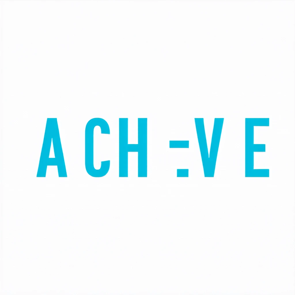
1. Motivational Posters
The style’s simplicity lets motivational words like “ACHIEVE” command attention and inspire action. The bold color adds emotional resonance, making it perfect for offices, classrooms, or social media inspiration.
2. Modern Branding and Logos
A single-color wordmark, like “NEXUS” in dark green, delivers a timeless and professional identity. This approach is popular among tech companies, startups, and creative agencies seeking a memorable mark.
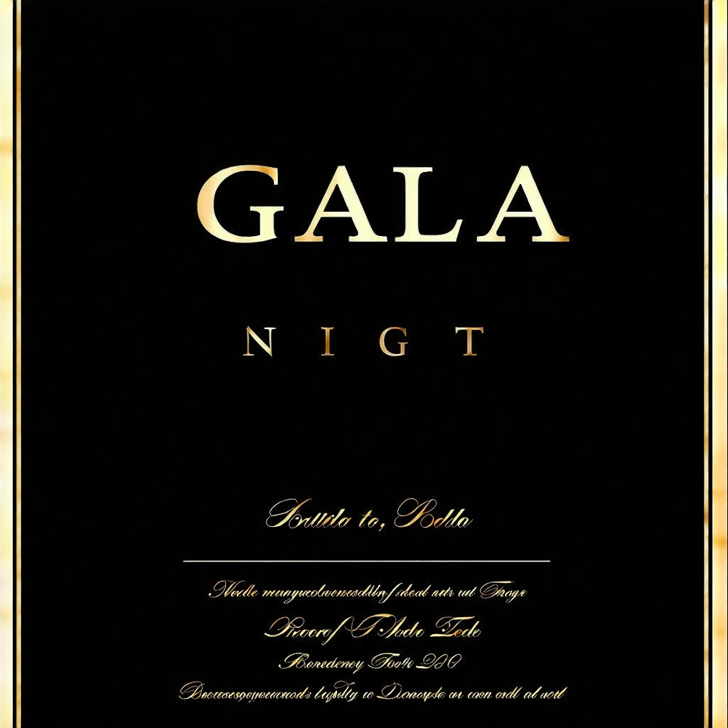
3. Event Invitations
For formal events, monocolor words like “GALA NIGHT” in gold on black evoke sophistication and exclusivity. The minimalism ensures elegance and easy readability, both in print and digital formats.
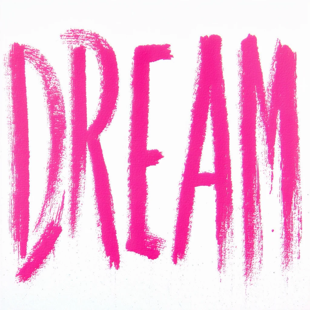
4. Artistic Typography Art
Words like “DREAM” rendered in expressive monocolor brush fonts become both a visual and artistic statement. This is ideal for home decor, gallery prints, or social campaigns seeking creative flair.
Words like “UPDATE” in a vibrant red immediately capture attention in a crowded feed, ensuring critical information or news is seen and understood.
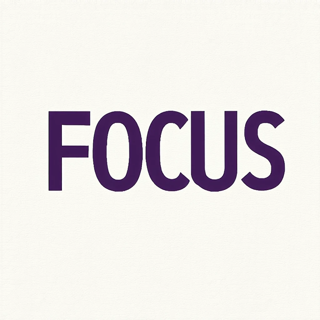
6. Book Covers
A bold title like “FOCUS” in deep purple stands out on shelves and digital stores, promising clarity and confidence to potential readers.
Pro Tips for Creating Effective Monocolor Words Visuals
1. Choose Your Color Wisely
Think about the psychological effects of colors. Match the color to the mood or message you want to convey. For example, blue for calm, red for urgency, green for growth.
2. Select Strong, Readable Fonts
Sans-serif and slab-serif fonts often work best for monocolor word effects. Avoid overly decorative fonts unless the style calls for artistic flair.
3. Keep Backgrounds Simple
The power of this style lies in its minimalism. Use plain or subtly textured backgrounds to avoid distracting from the main word.
4. Play with Scale and Placement
Don’t be afraid to use oversized text or creative alignment for extra impact. Centering, left-aligning, or even rotating the word can add visual interest.
What looks bold on a desktop might not translate as well to a small phone screen or in print. Always preview your design in multiple formats.
Conclusion
Monocolor Words is a timeless, versatile style that transforms simple text into bold visual statements. By harnessing minimalism, color psychology, and typographic strength, it delivers clarity and impact across branding, art, events, and digital communication. Whether you’re seeking to energize your brand, motivate an audience, or create stunning visual art, Monocolor Words provides a powerful toolkit for making words truly stand out.