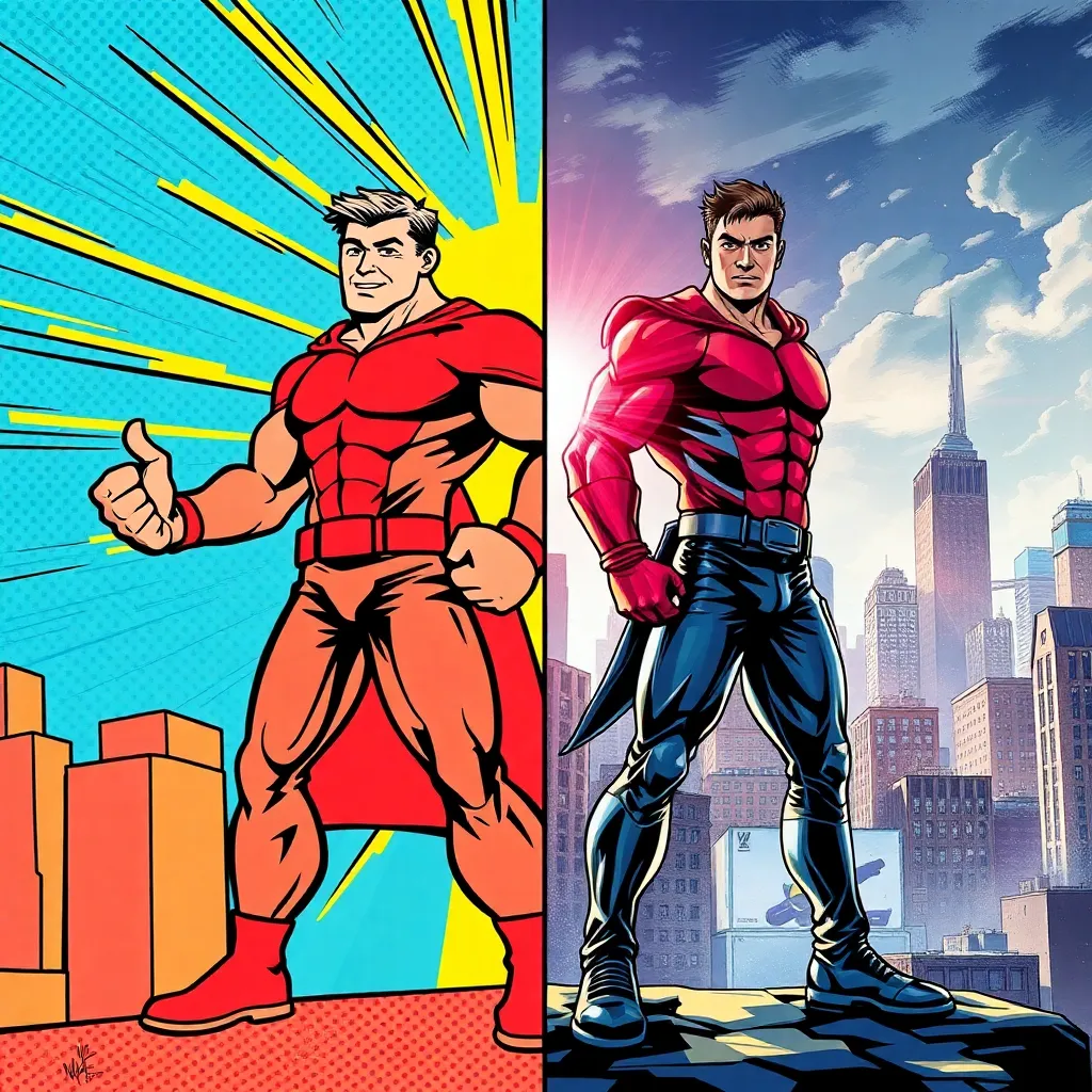
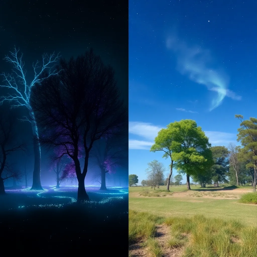
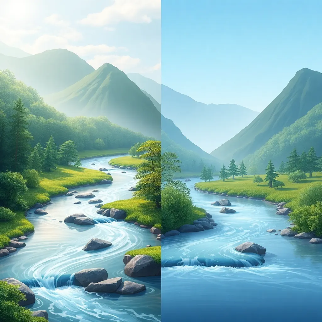
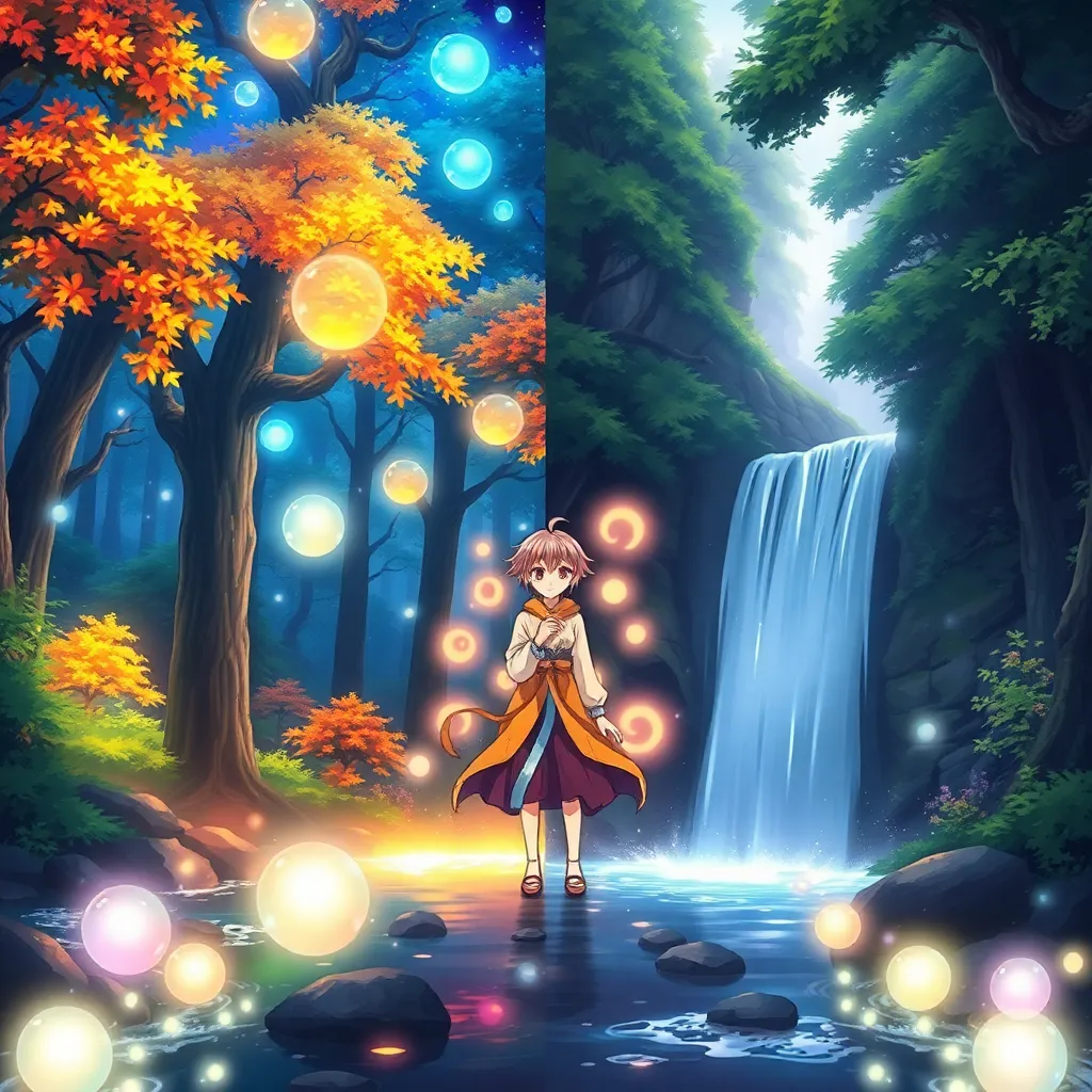
What is Warm Vector Style? — Description and History
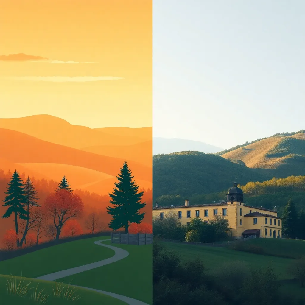
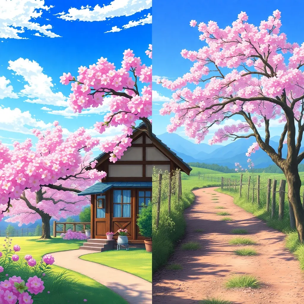
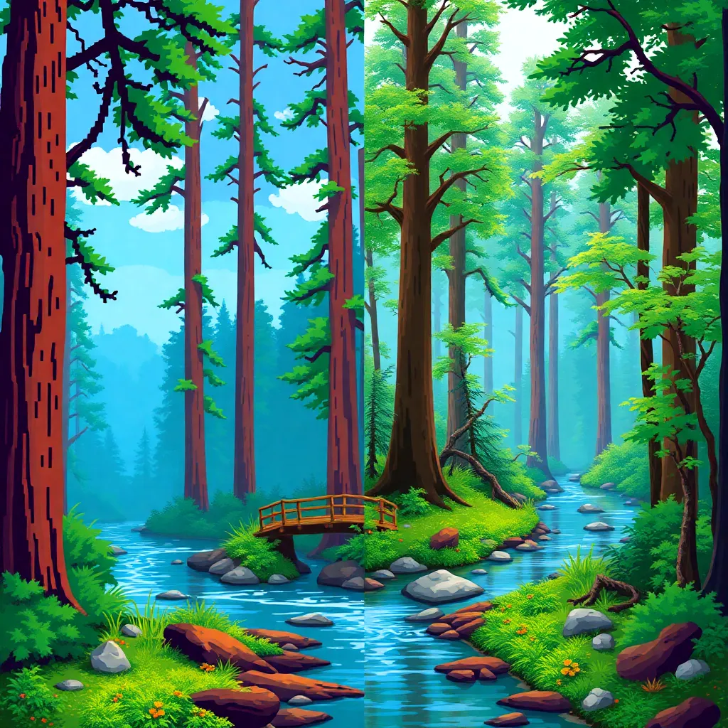
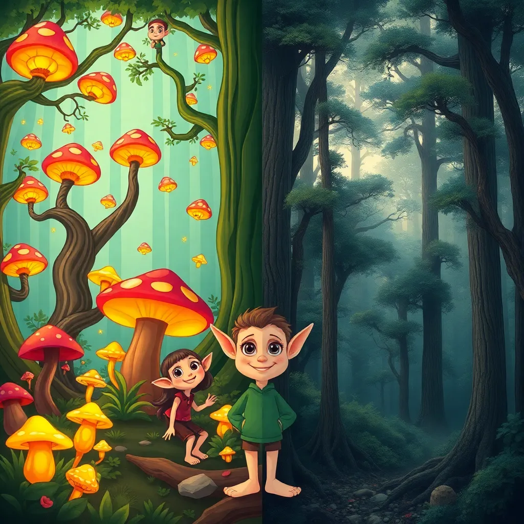
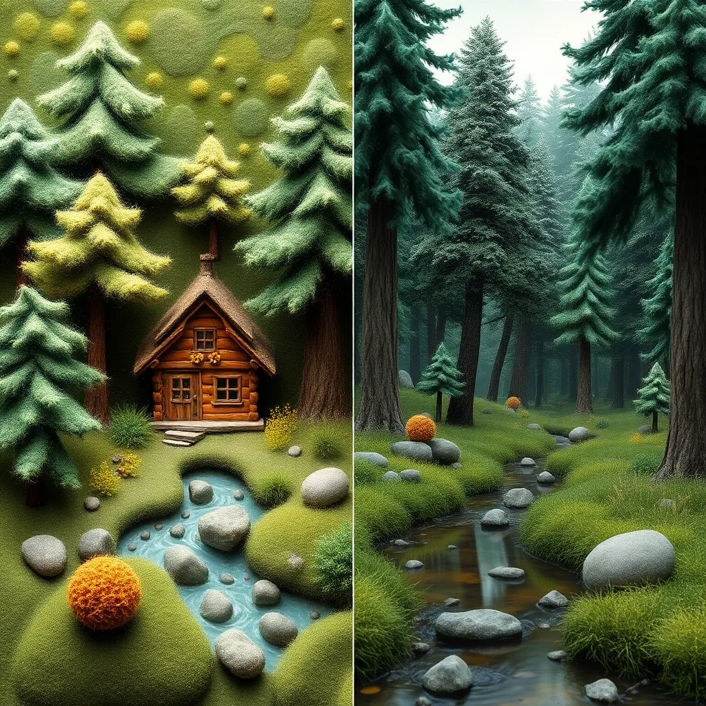
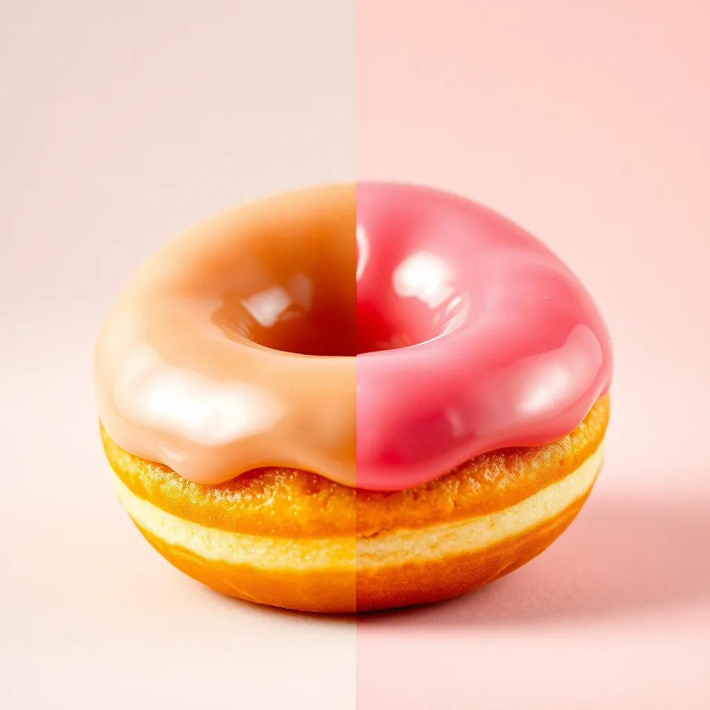
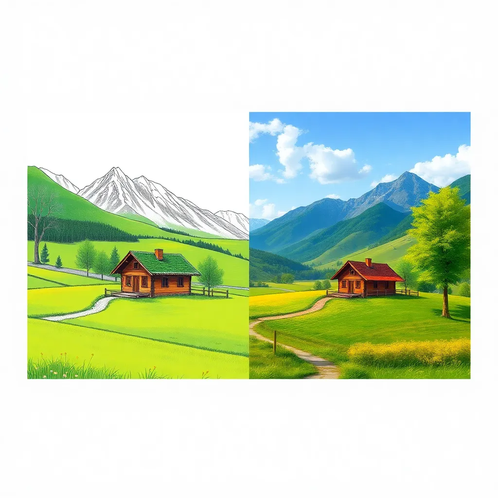
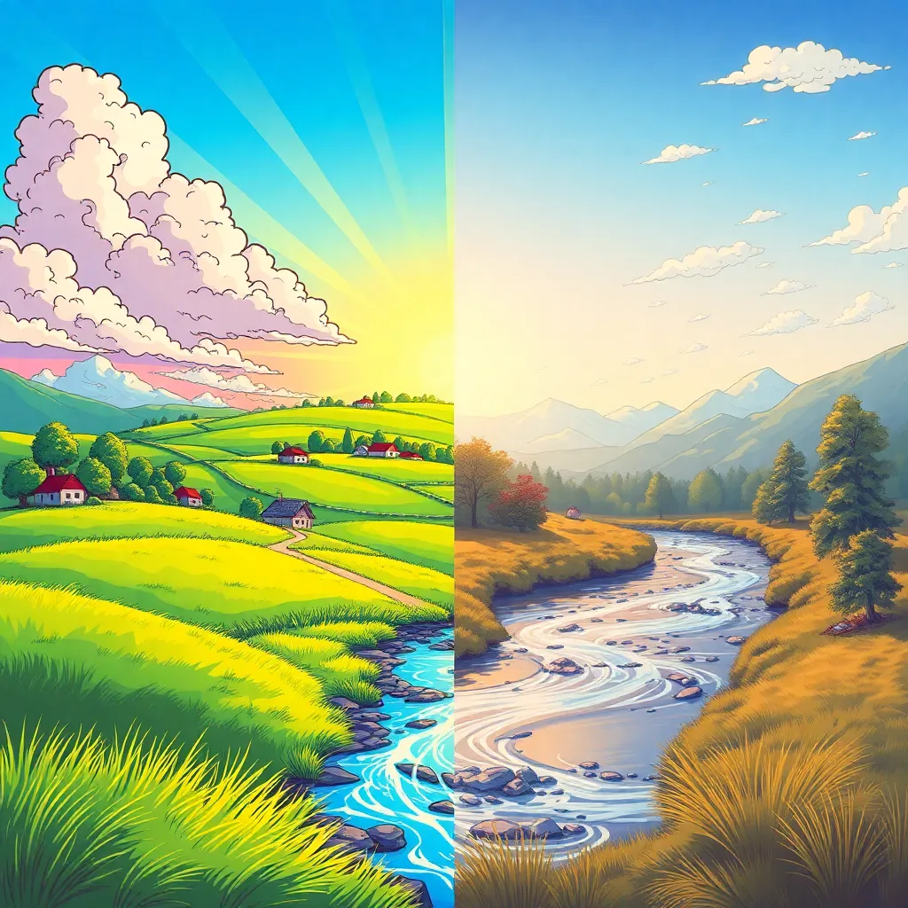
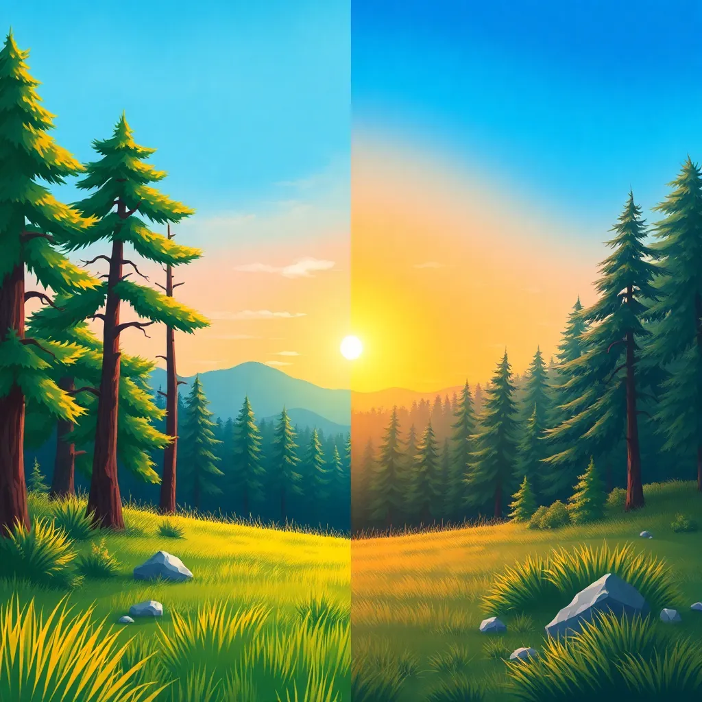
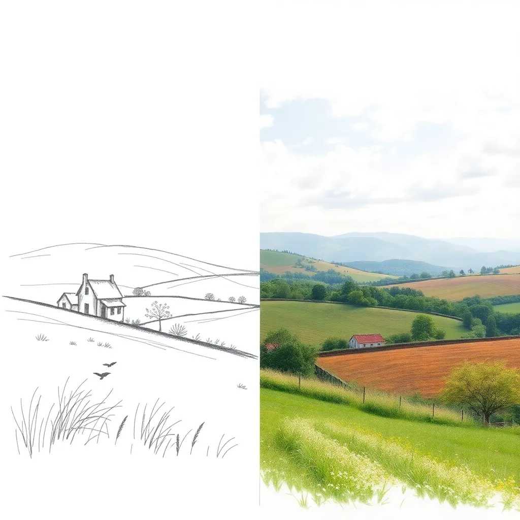
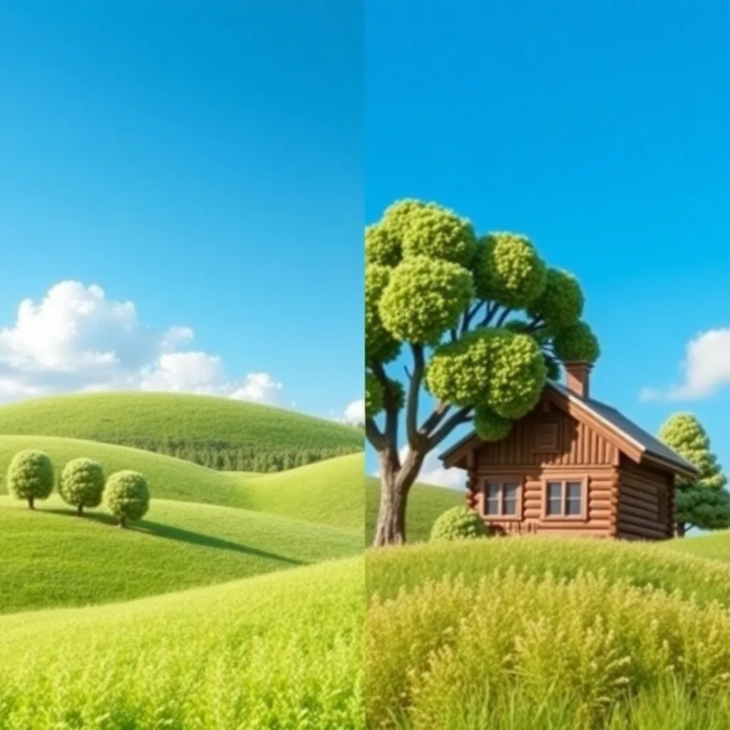
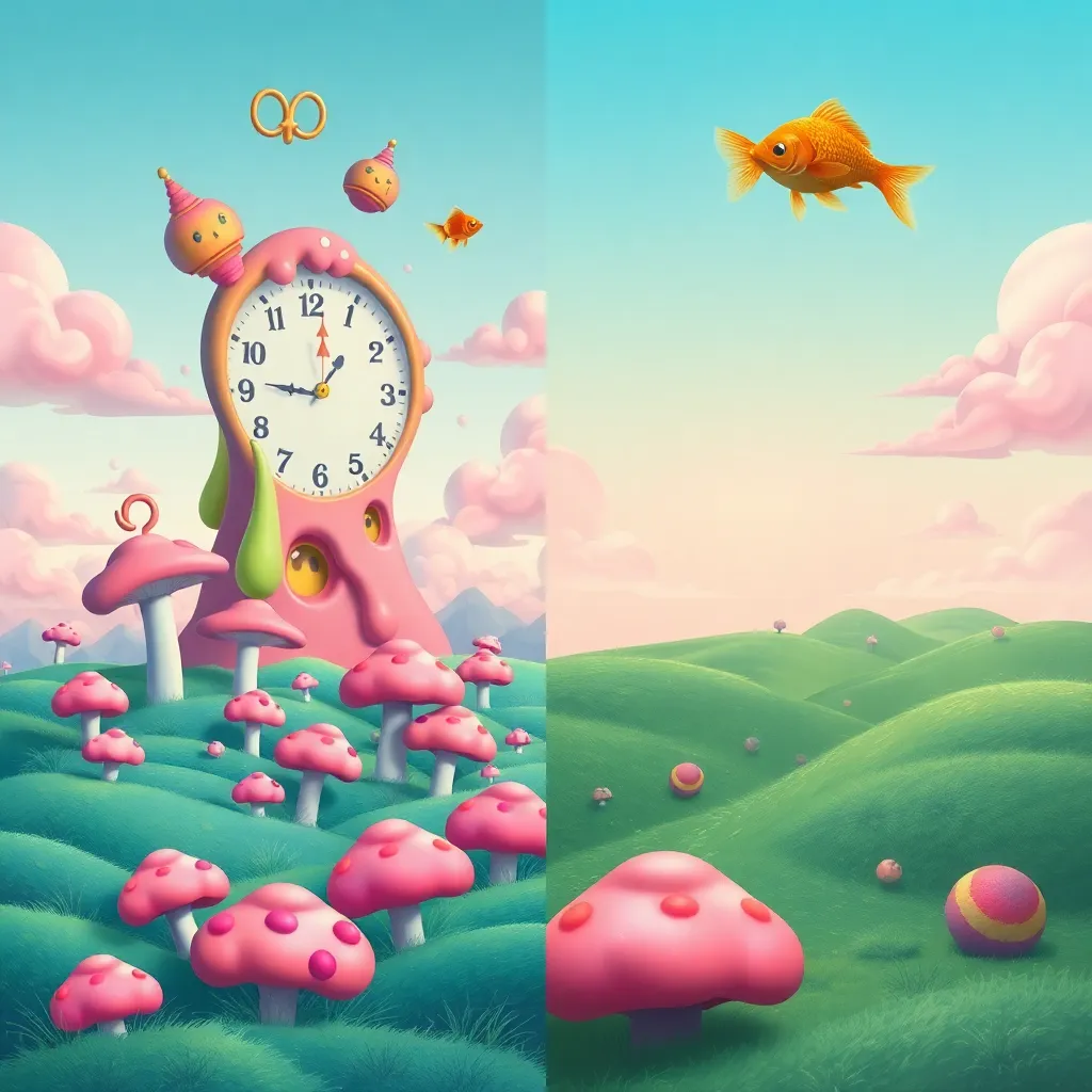
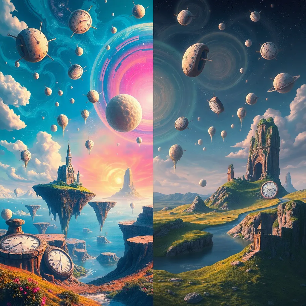
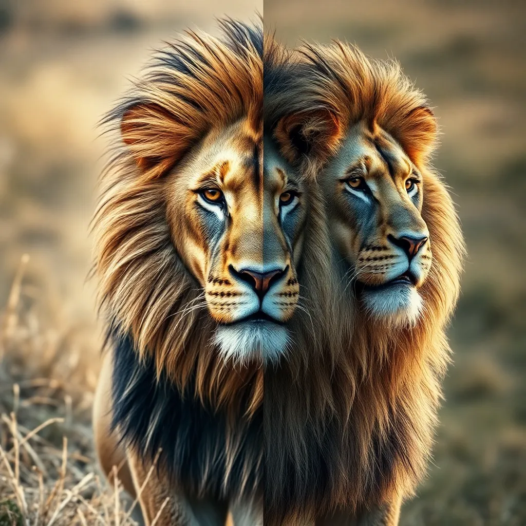
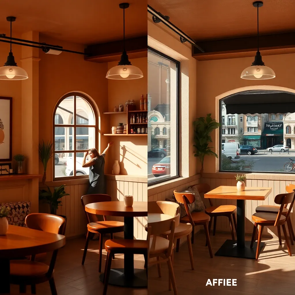
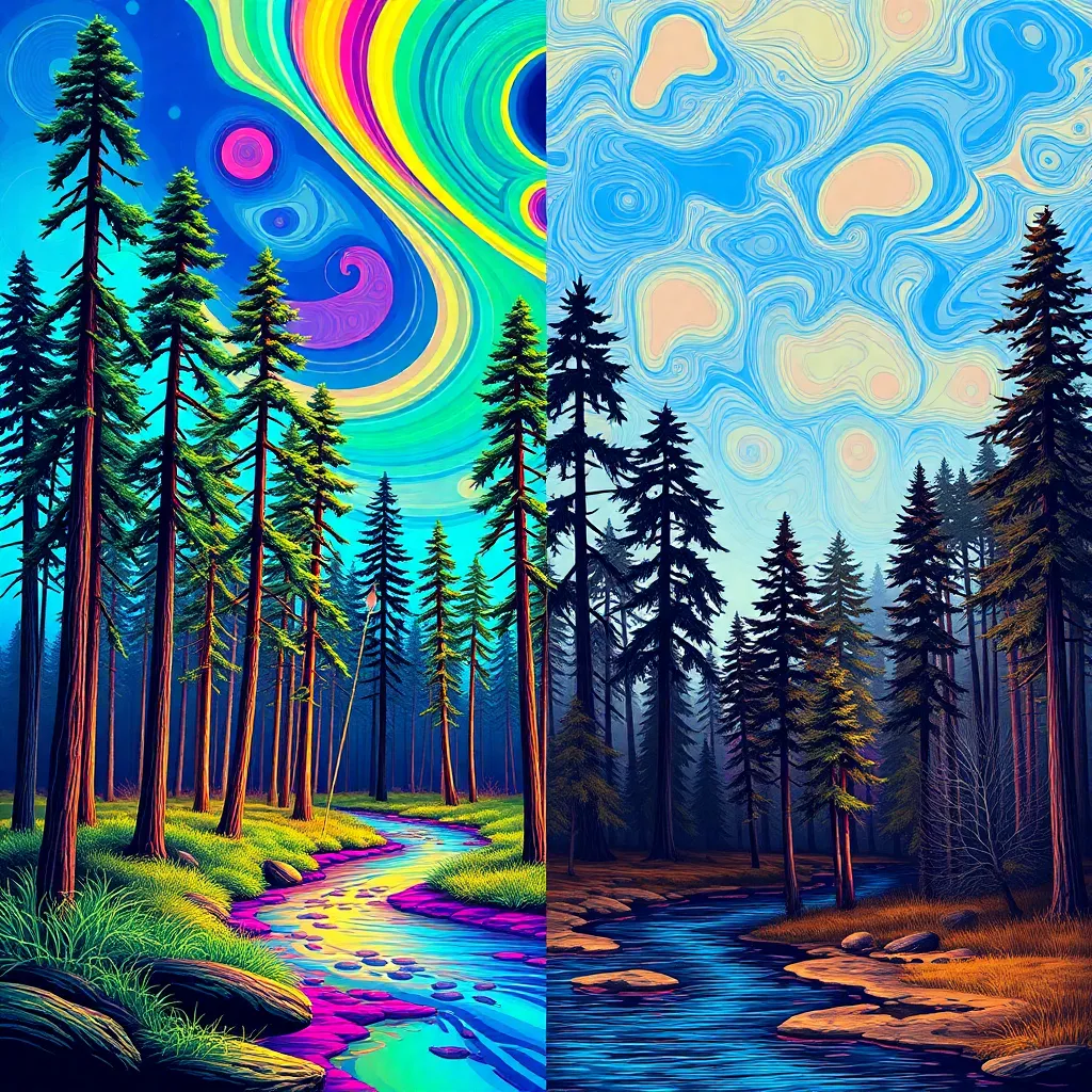
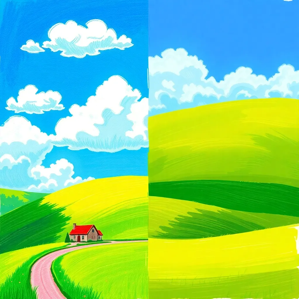
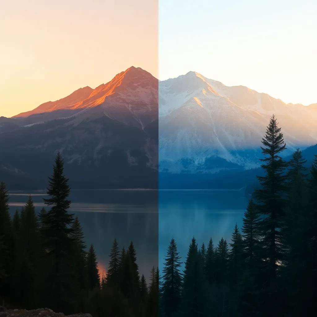
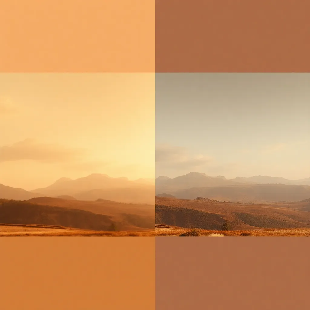
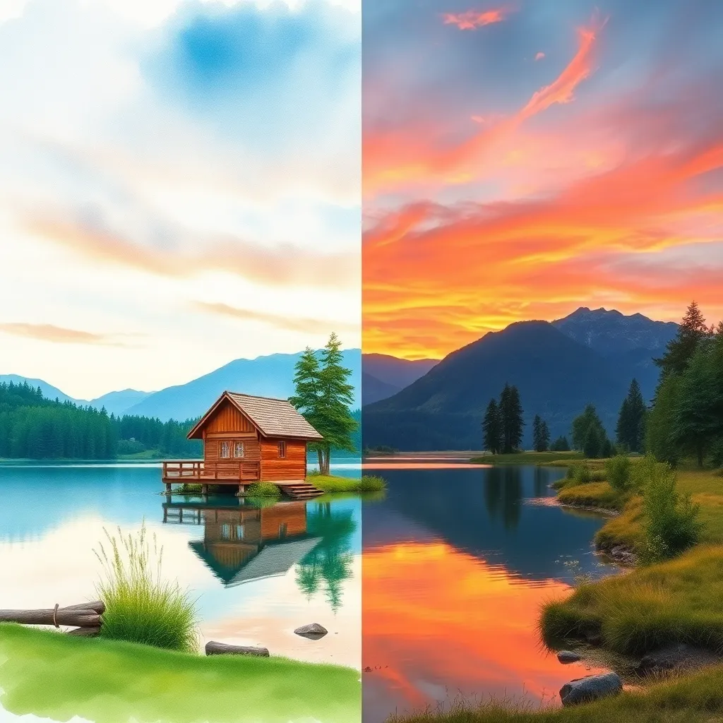
Warm Vector Style is a digital illustration and color grading approach that infuses images with a palette of warm hues—primarily oranges, yellows, reds, and browns—paired with clean vector lines and smooth shapes. This effect is rooted in the evolution of vector art and flat design, gaining prominence in the late 2010s as digital content creators sought visually engaging and emotionally resonant imagery for web and print.
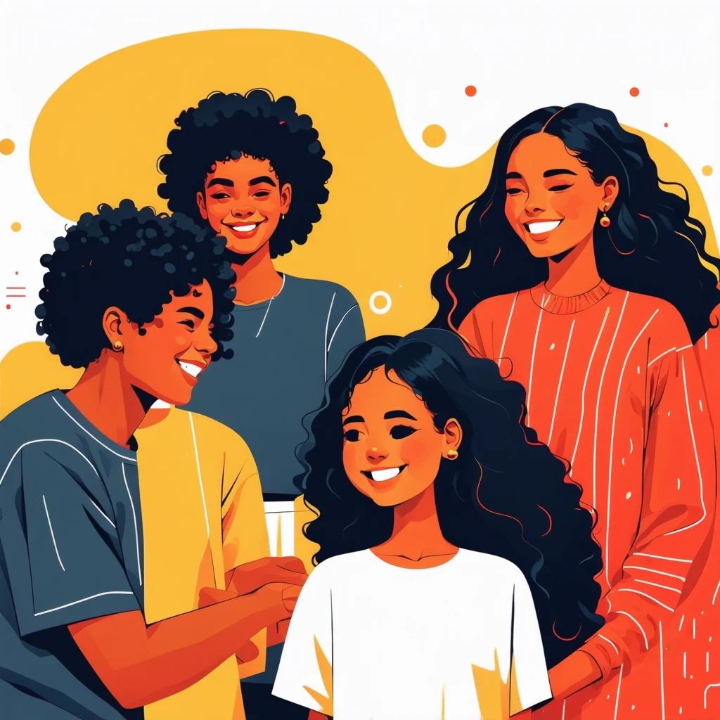
Unlike traditional vector art, which often uses a broad spectrum of colors and sharp geometry, Warm Vector Style emphasizes harmony and friendliness. The colors evoke feelings of comfort, energy, and happiness, making visuals more approachable and relatable. The style is inspired by mid-century modern illustration, contemporary editorial design, and the increasing demand for human-centric, positive digital experiences.
Who Uses Warm Vector Style?
Warm Vector Style is embraced by a diverse range of creatives and professionals, including:
- Web Designers: For landing pages, hero banners, and user interface illustrations, providing a welcoming first impression.
- Editorial Illustrators: Enhancing articles and blog posts with visuals that draw readers in.
- Children’s Book Authors & Publishers: Creating playful and engaging artwork that appeals to young audiences and their caregivers.
- Educators and Educational Publishers: Designing classroom posters, learning materials, and activity sheets that foster a positive environment.
- Marketing and Social Media Teams: Developing campaign graphics and posts that stand out in crowded feeds.
- Greeting Card Designers: Crafting heartfelt, inviting cards for all occasions.
This style is particularly favored by brands and organizations seeking to convey warmth, approachability, and inclusivity.
How Does Warm Vector Style Enhance Photos and Illustrations?
Warm Vector Style elevates visuals in several impactful ways:
Emotional Connection:
The warm color palette taps into psychological associations with comfort, joy, and optimism. This emotional resonance makes imagery more memorable and impactful.
Cohesive Branding:
Using a consistent set of warm colors and vector elements creates a unified look across marketing materials, websites, and product packaging—important for brand recognition and trust.
Visual Clarity:
Clean lines, minimalistic shapes, and soft edges help communicate ideas quickly and effectively. This clarity is crucial for infographics, educational posters, and social media graphics.
Modern, Inviting Aesthetic:
The style feels contemporary and fresh, appealing to audiences who value both aesthetics and functionality. Its approachable look increases engagement and time spent with content.
Versatility:
Warm Vector Style adapts seamlessly to various subject matters—from playful children’s scenes to professional business graphics—enhancing the content without overwhelming it.
Use Cases of Warm Vector Style
1. Website Landing Pages
Warm Vector Style is ideal for modern websites and app landing pages. The inviting colors and friendly illustrations improve user experience, reduce bounce rates, and make digital platforms feel more human and approachable.
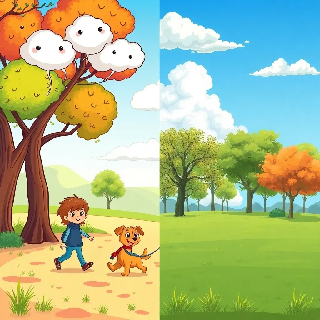
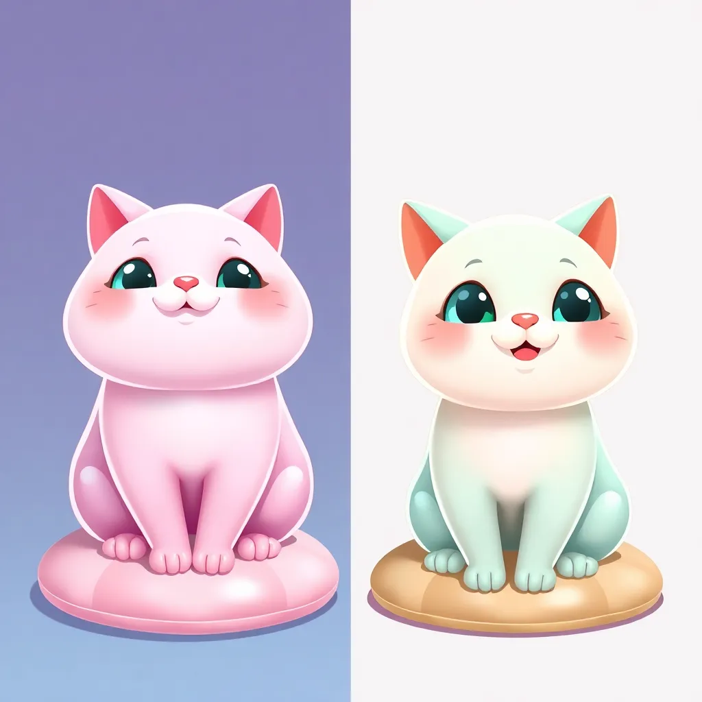
2. Children’s Book Illustrations
This style excels in children’s literature, turning stories into vibrant, engaging adventures. The warmth and simplicity foster emotional connections, and the clear shapes help young readers understand narratives more easily.
With its eye-catching colors and modern vibe, Warm Vector Style increases engagement on social platforms. It helps posts stand out, drives brand recognition, and encourages sharing due to its friendly appeal.
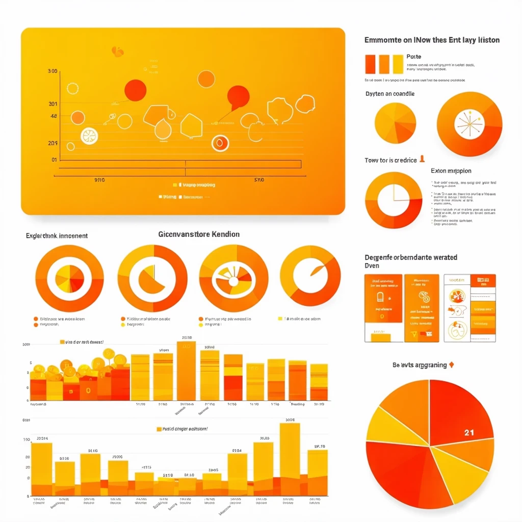
4. Infographics
Complex data becomes accessible and attractive when presented in warm vector graphics. The palette and clarity make information easy to digest and enjoyable to explore.
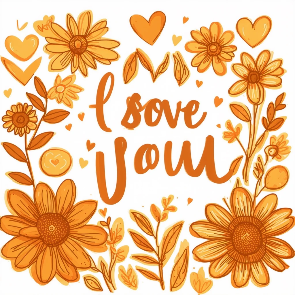
5. Greeting Cards
The heartfelt and inviting quality of Warm Vector Style is perfect for cards meant to convey affection, celebration, or encouragement. The soft, hand-drawn elements enhance the sincerity of the message.
6. Educational Posters and Materials
In classrooms and learning environments, this style fosters positivity and inclusivity, making educational content more approachable and effective for learners of all ages.
Pro Tips for Using Warm Vector Style
- Choose a Consistent Warm Palette: Limit your color selection to cohesive shades of orange, yellow, red, and brown. Consistency strengthens the overall effect.
- Keep Lines Clean and Shapes Minimal: Avoid clutter. Use simple, well-defined shapes to maintain clarity and focus.
- Leverage Soft Shadows and Gradients: Subtle gradients and shadows add depth without detracting from the style’s minimalism.
- Balance Warmth with Neutral Space: Leave plenty of white or neutral space to prevent visuals from feeling overwhelming or too busy.
- Adapt for Your Audience: While the style is broadly appealing, tailor the warmth and friendliness to suit your brand and viewers’ expectations.
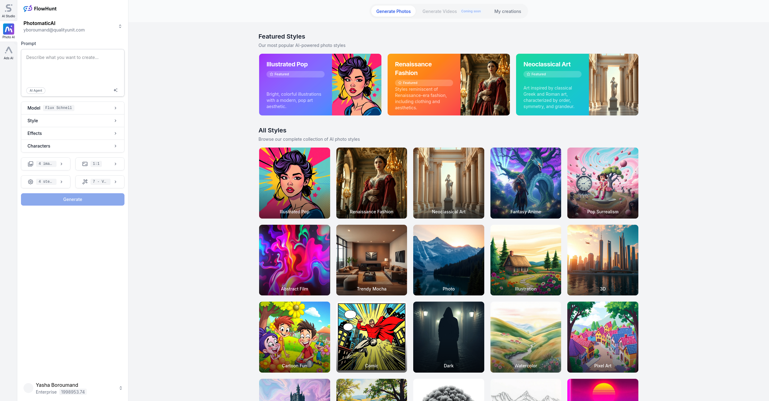
- Use AI Tools Wisely: Platforms like Photomatic AI can quickly generate warm vector illustrations, but always review and customize outputs for your unique needs.
Conclusion
Warm Vector Style is a powerful, adaptable approach for anyone aiming to create welcoming, visually compelling content. Its timeless palette and clean design principles make it ideal for digital and print projects across industries. Whether you’re crafting a website, telling a story, or educating the next generation, this style ensures your visuals are as inviting as your message.